
How Apple logos have changed. Do you know why Steve Jobs chose a bitten apple for the Apple logo?
April 1, 1976 Steve Jobs and founded Apple. Today, 41 years later, it is difficult to find a person who has not heard of her. The company that gave the world the mouse, trackpad and graphical user interface has not yet fully revealed the secret of the origin of its logo - a bitten apple.
Helped make the brand what it is today. The modern user knows what the company's logo looks like, and some even remember the rainbow-colored apple decorating the gray Macintosh. But when it comes to why Apple has a bitten apple as their logo, many are forced to admit that they do not know the correct answer to this question.
What does the apple have to do with it?
It seems that even now no one fully understands why the company was named Apple. Hardly anyone associates computers with apples. The history of the appearance of such an unusual brand symbol is overgrown with myths and legends. Because Steve Jobs was working on an apple farm in the summer of 1975? Or was it all about his love for the Beatles (their recording studio was called Apple Records)? Or he just liked McIntosh apples.
Where did the history of the logo begin?
Few people know, but in 1976 Apple had a different logo. It showed Newton resting under an apple tree. Such a brand name did not look stylish at all and was not suitable for use in small sizes. If you look at the instructions for the Apple I (the company’s very first computer), you can see exactly this complex logo.

So why does Apple have a bitten apple as their logo? The answer to the question goes back to 1976, when the brand was first born. Anyone who is even slightly interested in modern technology knows that Apple was founded by Steve Jobs and Steve Wozniak. In fact, the company had three, and not two, as is commonly believed, founders - Steve Jobs, Steve Wozniak and the lesser known Ron Wayne. The latter gave up his stake in the company less than two weeks after its creation. Now Ron admits that even then he saw a successful future for the young company, but does not regret his choice. And if he had the opportunity to change his mind, he would have done the same.

The reason for refusing a 10% stake in a promising company lies in Ron's negative past experiences and his reluctance to take risks. At the very beginning of Apple's journey, it received an order for 50 computers. In order to collect them, it was necessary to take out a loan of $15,000. Wayne had heard that the customer company had a history of difficulty paying suppliers. Being no longer young (43 years old), Ron did not want to take risks by getting involved in transactions with the possibility of losing all his property. Unlike both Steves, he owned his own house and car.
It was Ron Wayne who, at the beginning of the company's founding, drew the first logo - an image of the brilliant Isaac Newton reading a book under an apple tree.

The appearance of the famous logo
The logo appeared shortly before the release of the Apple II. The history of its origin began in April 1977. Steve Jobs turned to Rob Yanov, a middle-aged designer at Regis McKenna Advertising. Back then, many people predicted failure for the company if they kept the same logo. He was too intellectual and not suitable for depicting him in small sizes. According to the author of the book "Little Kingdom": private story Apple Computer" by Michael Morritz, Steve Jobs actually believed that the logo could be one of the reasons for the poor sales of the Apple I. Interested, Rob spent several days looking at apples purchased from a nearby store from different angles. As a result, the designer came to the conclusion that simplicity is the key to success, and drew a logo in the form of a monochrome bitten apple.
rainbow apple

Jobs liked the idea, but he insisted that the logo be in color, despite all the manager’s attempts advertising company dissuade him due to too high printing costs. By the way, all the attacks of the company’s ill-wishers, who claim that Yanov borrowed the idea of a colored logo from the well-known rainbow flag, have no basis - the symbol of sexual minorities began to be used by the community only in 1979. However, there is an opinion that the similarity of the flags was the reason for changing the color of the logo in 1998. The bitten apple became what it was originally intended to be - monochrome.
“There was also a practical reason for the multi-colored stripes in the first logo: the Apple II was the first personal computer that could display color images on a monitor,” Yanov explained.
The most expensive logo
Steve Jobs was responsible for most of the work when creating the logo. The challenge was to print it in multiple colors next to each other. The four multi-stage color printing technologies known at the time left the risk that layers could be misaligned and overlap each other. Yanov suggested dividing the layers with thin black lines. This would solve the problem and make printing cheaper. However, Steve Jobs firmly decided that the logo should be without stripes. For this reason, Apple's Michael M. Scott called it "the most damn expensive logo ever created."
It is noteworthy that Rob Yanov did not receive a penny for his legendary work. “They didn’t even send postcards,” he said in an interview. Steve Jobs managed to establish an excellent relationship with the chief marketer of Silicon Valley, and he allowed the growing company to use the services of his subordinates for free.
Bitten Apple
According to Lensmeyer, Rob Janow started with a silhouette of a black apple on a white background, but felt something was missing. A play on words Apple had previously used in advertising for the Apple I, Yanov was told to bite the apple (“bite” in English translated as “bite” and pronounced like a computer “byte”).
“The bitten apple means that the logo also no longer resembles a tomato, cherry or any other fruit,” Yanov said.
Bill Kelly, also of Regis McKenna Advertising, remembers a different story. He says that a bitten apple is a symbol of temptation and the acquisition of knowledge (a reference to the biblical tree of knowledge). A hint of how modern technologies helping humanity learn and develop faster, but at the same time making it more and more dependent on them.
inspired by Apple?
In 1954, computer scientist and brilliant mathematician Alan Turing died after biting into a cyanide-laced apple. For a long time it was assumed to be a suicide, possibly due to the chemical castration that the British government imposed on him after admitting to having a sexual relationship with a man. Although it is now assumed that Turing's suicide was not deliberate. He was often careless with his experiments and could easily have accidentally inhaled cyanide or placed an apple in a puddle of cyanide.

Whatever happened, the bitten apple was found at Turing's bedside. Two decades later, two guys began making computers in their garage. They knew about Turing's contributions to programming and computer science and decided to honor him. And the world received an iconic logo.
According to the designer who created the logo, Rob Yanov, this beautiful story does not apply to reality. "It's just a wonderful urban legend," he said in 2009. Other theories - a reference to the first woman, Eve biting the forbidden fruit, or Newton's discovery of gravity - are also wrong.
However, when actor Stephen Fry once asked his good friend Steve Jobs about whether he had famous logo attitude towards the Turing apple, Jobs responded: "God, we wish it were like that."
What does a bitten apple mean for Apple?
The true reason for the birth of such an unusual brand name remains a mystery even to Apple employees. On the other hand, such an abundance of legends around this gives a special mystery to the history of the logo, allowing each user to interpret it in their own way.

According to Apple employee Jean-Louis Gasier, this is where its brilliance lies: “Our logo reflects both passion and disorder, reason and hope. We couldn't have asked for anything better." Today no one dares to deny that a memorable and seemingly simple icon played a crucial role in the development of the brand.
The first Apple logo was created by Ron Wayne. This name says little not only to ordinary people, but even to geeks. Meanwhile, Ronald is the third co-founder of Apple, and also the biggest loser of the 20th century. He sold his 10 percent stake in the company for $800 just 11 days after registration. If he had not taken this rash step, Ronald would now be one of the wealthiest people in the world with a fortune of $30 billion. Analysts say Apple's value will triple in three years, which means Wayne may have lost about $100 billion simply by not believing in Apple.
The logo created by Ronald Wayne has nothing in common with the current one. It was a miniature work of art. In the center was the outstanding English scientist Isaac Newton, on whom an apple was about to fall (insight!). In the future, the “Newton theme” will be continued when Apple releases its PDA.
If you enlarge the logo, you will notice that along the border there is the text: Newton... A Mind Forever Voyaging Through Strange Seas of Thought... Alone (Newton... A mind that sails alone through strange seas of thought). This is a line from William Wordsworth's autobiographical poem "The Prelude", which in its entirety goes like this:
And from my pillow, looking forth by light
Of moon or favoring stars, I could behold
The antechapel where the statue stood
Of Newton with his prism and silent face,
The marble index of a mind for ever
Voyaging through strange seas of Thought, alone.
Translated it looks like this:
From my pillow, illuminated by the light
I could see the moon and good stars
On the pedestal is a statue of Newton.
He is holding a prism. Quiet face
Like the dial of a mind that's alone
Sailing through the strange seas of Thought.
 The logo turned out to be interesting (all these references to Newton, who really was lonely, a touch of mystery, etc.), but not very suitable for reality modern business. Therefore, Wayne's work was used for about a year. Steve Jobs then turned to graphic designer Rob Janoff for help. It was necessary to create a simple, modern-looking, well-recognizable logo.
Rob completed this task in about a week. In an interview with the Revert to Saved blog, Yanov talked about how the logo was created. Rob bought apples, put them in a bowl and began to draw, gradually removing unnecessary details. The famous “bite” was made on purpose: the logo had to be drawn so that it would be strongly associated with apples, and not other fruits/vegetables/berries. The similarity of the pronunciation byte/bite (byte/bite) also played into its favor.
![]()
Rob Yanov made the logo in color, which provided good ground for speculation and myths. The most common one, actively supported by Win users and Linux users, comes down to the fact that the Apple symbol reflects support for sexual minorities. This is not entirely true. Apple truly supports the LGBT community, as evidenced by recent video, however, the color logo was created a year before gays began using the rainbow as a symbol.
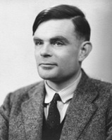 The second myth is even more interesting. They say that an apple painted in the colors of the rainbow is a kind of sign of respect to Alan Turing. Turing is an outstanding English mathematician and cryptographer who made a significant contribution to the fight against fascism. During World War II, he cracked the Kriegsmarine and Enigma ciphers, and after that he had a huge influence on computer science (Turing test, work on the theory of artificial intelligence). Turing's merits did not save him from prosecution for homosexuality. Alan faced two years in prison if he did not agree to hormone therapy (which, among other things, led to breast growth and chemical castration). In addition, Turing was deprived of his most valuable asset: the opportunity to do what he loved - cryptography. As a result, Alan became a recluse, and then completely committed suicide. Moreover, the form of suicide was very unusual: Turing bit off an apple, which he had previously pumped with cyanide.
Rob Yanov refutes both myths. According to him, there is no need to look secret meaning. Apple's color logo was intended to reflect the fact that the company produces computers with color monitors. The Mac display at that time could display six colors. These colors were precisely indicated on the logo. There is also no pattern in the arrangement of colors. Yanov placed the colors in random order, only the green color was placed first intentionally.
The logo existed in this form for 22 years. In 1998, Steve Jobs, who had previously been ousted from Apple, returned to the company. Apple was experiencing huge financial problems at the time. Competitors sarcastically advised to close the shop and distribute the money to shareholders. Drastic measures were needed. And do you know what pulled Apple out of the crisis? Industrial designer Jonathan Ive has come up with a new case for the iMac G3.

![]() Computers that look like candy canes literally saved Apple. Moreover, they became iconic - their images appeared in films, TV series, and glossy magazines. It is clear that a colorful logo on a colored poppy would look stupid. Apple has moved away from using a color logo. So, since 1998, we have seen a laconic monochrome logo. The company has matured. And with her, so do we.
Computers that look like candy canes literally saved Apple. Moreover, they became iconic - their images appeared in films, TV series, and glossy magazines. It is clear that a colorful logo on a colored poppy would look stupid. Apple has moved away from using a color logo. So, since 1998, we have seen a laconic monochrome logo. The company has matured. And with her, so do we.
Rob Janow created an outstanding logo. This is not a banal insignia, but real Symbol. But Yanov’s achievements were not particularly noted by Apple. At the beginning of this post I mentioned the Nike logo. It was created by Carolyn Davidson, a student and freelancer from Oregon. Nike, a young company at the time, paid $35 for the work. But ten years later, the company’s founder, Phillip Knight, gave her an expensive ring with a diamond “stroke” - corporate style, as well as an envelope with company shares. Knight appreciated the designer's work, making her a co-owner of Nike (albeit with a small stake).
In our turbulent times, people do not have enough time to sleep, let alone remember all sorts of different brands. However, even in such conditions, there are several logos that almost every inhabitant of the Earth knows. For example, you can recall the ideal Mercedes star, the well-known Coca Cola inscription, the outline of the Nike symbol, the white and blue circle of BMW. Among these leaders we can highlight the Apple logo. Many people often wonder about the history of the origin of the Apple logo, and how it has changed over the decades.When did the Apple logo appear?
Apple owes its first logo to Ron Wayne. Now the name of this man has almost been forgotten and it is unlikely that people well versed in the history of Apple remember him. Although this man was the third co-founder of the tiny Apple company. But no one remembers him for a very simple reason, this loser, what else can you call a person who got rid of the shares of a young company just 11 days after its founding. He sold them for $800. Imagine how much money he would have now. After all, he had 10 percent of the shares, and in modern times this is a cosmic amount. The symbol that Wayne came up with for his company has nothing in common with the current emblem. It was a carefully designed picture in which Isaac Newton occupied the main place, with an apple on top, symbolizing insight. Much later, Apple will remember Newton when it begins to develop the first PDAs.
On the first Apple logo small words are written, if you look closely you can read " Newton… A Mind Forever Voyaging Through Strange Seas of Thought… Alone", which can be translated into Russian as " Newton...The mind always sails through many seas of thought...alone". This paragraph was borrowed from a fairly well-known poem in the West by William Wordsworth called “The Prelude.”
And indeed the symbol turned out to be very sensible. All these mysterious references to Isaac Newton gave the logo a certain air of mystery. However, this logo was very unsuitable for modern business. It is for this reason that a year after the founding of Apple, Steve Jobs decided to find a completely new symbol. So he went to a wonderful designer named Rob Janoff. Steve Jobs gave the task to create such an emblem so that it would look modern and at the same time be perfectly recognizable among many others like it.
 Within a week this graphic designer was completely occupied with solving the task at hand. Many years later, he was interviewed in which he revealed the secret of how he came up with this logo. Rob went to the store where he bought apples of various shades, then he put them in a vase and began to draw. Gradually removing various elements. He drew that very bite quite deliberately, because his task was to depict such an image of the fruit so that it would be firmly associated with an apple, and not, say, with berries, vegetables or fruits. Moreover, in English the word byte and bite off are written almost identically (byte/bite), this added even more meaning.
Myths of the appearance of the Apple logo
The first legend. Rob depicted the company logo with rainbow colors. Subsequently, many people began to slander that this coloring was somehow very similar to the symbolism of gay minorities, and, speaking in Russian, to the symbolism of homosexuals. Although this is fundamentally wrong, because that famous emblem began to be used a whole year earlier than the buggers invented their logo in the form of a rainbow. Second legend. It is believed that the apple painted in rainbow colors is a kind of tribute to A. Turing. This man is famous for being able to hack Enigma and Kriegsmarine code, and after the war had a strong influence on the development of information technology. For example, he came up with a special intelligence test, which later became known as Turing test.
However, there were some buggers here too. In the West, there is no escape from this, total pederasty. So, it turns out that Turing was gay and the authorities began to persecute him for homosexuality, and a not very bright future awaited him. After all, serving two years in prison, where every prisoner knows about your inclinations, is not very similar to a walk through a flowery meadow. As a result, he was forced to undergo a course of hormone therapy, as a result of which many people experience increased female breast and infertility occurs. Moreover, the tolerant authorities forbade this talented pederast to do his favorite thing. No, in this case we mean not love games with men, but cryptography.
This was a cruel blow to the fragile and tender soul of the gay scientist. As a result of mental anguish, he committed suicide some time later. Yes, being a homosexual in the West is a thankless task, and sometimes even dangerous for the psyche. What does an apple have to do with it, you ask? The thing is that Turing decided to leave this life that was disgusting to him in an unusual way. After all, homosexuals are creative people. So he bought an apple at the store and entered it lethal dose potassium cyanide, after which he took a bite of it with gusto. However, alas, he did not have time to chew this juicy piece.
However, Rob Yanov has his own opinion on these legends. He believes that there is no double bottom in the Apple logo. The company's rainbow symbol was supposed to represent the fact that their company is engaged in the development and production of computers, and specifically with color monitors. At that blessed time, the Mac computer screen had the ability to transmit six shades. It was these colors that were included in Apple logo. Moreover, all shades were installed in random order, and only green Rob placed the first one on purpose.
This rainbow logo has existed for twenty-two years.. After returning to the company" prodigal son"Steve Jobs in 1998, who had previously been expelled in disgrace, positive changes began. In those distant times, this corporation had very big problems With in cash. Most of Apple's competitors slept and saw that this company was about to go down. In order to survive it was necessary to radically change the company's policy.
And you ask what miracle helped pull out dying company to life? And everyone was saved by a wonderful designer named Jonathan Ive. He created the latest case for the brand new IMAC G3.
 This Mac pulled Apple out of the financial abyss and opened up new horizons for it. Moreover, from that moment on, this company was noticed in the very high level, its logo began to be used in glossy magazines, TV series and films.
It became clear that the "rainbow apple" logo would look very strange on the Macintosh g3. Therefore, reluctantly, the company's managers decided to rebrand and make a new design. Therefore, starting in 1998, instead of the color “bitten apple” emblem, a monochrome logo appeared. So the company crossed the threshold childhood and has become mature and strong, and it seems that nothing can shake her unshakable confidence, except perhaps the “Financial Apocalypse”.
Evolution Apple logo
The famous bitten apple is a simple and laconic icon that symbolically crowns the complex structure of the giant Apple corporation, the name of which is familiar to everyone. It is quite natural that it gives rise to a lot of interpretations and acquires meanings. It is seen as both the biblical apple of discord and Turing’s apple, which the scientist bit into and passed away. Any interpretations have the right to life, but what is interesting, first of all, are the meanings that the creators purposefully intended.
Such a simple sign as an apple really provides many reasons for creating additional meanings, but the starting point should be considered the very first Apple logo, which was created by artist Ron Wayne. It was a monochrome miniature depicting Isaac Newton sitting under a tree with an apple above him. According to legend, the scientist was prompted to create the foundations of the theory of gravity, becoming one of the symbols of insight.
The logo was accepted, but Steve Jobs immediately realized that a modern company needed a more modern logo. Therefore, it was decided to discard all unnecessary things and make the sign as simple as possible. A year later, it was created by designer Rob Yanov - it was already a bitten apple painted in all the colors of the rainbow.
Why did the apple become bitten?
Since the shape of the logo was simple, it could be confused with other fruits, or even not immediately understand what image was applied to the company’s products. A bite made the sign more unambiguous, and also really created an attractive hint of the forbidden fruit, which is known to be sweet. But still, a practical approach is paramount in this case.
There is also an unconfirmed version that the apple became bitten, since the sign of the whole was already occupied.
Sometimes an apple is just an apple
A huge army of fans and opponents of Apple have created many legends about the history of its origin and the meanings inherent in the logo. The most common one says that the logo, painted in all the colors of the rainbow, has something to do with the LGBT community. Apple, although it supports the rights of sexual minorities, did not include such a meaning in the logo. The multi-colored logo simply noted that the company produces multi-colored monitors.
The company logo remained in color until 1998.
Moreover, the logo itself appeared long before the LGBT community began to use the rainbow as a symbol.
Video on the topic
Sources:
- Walter Isaacson, "Steve Jobs", 2011
Tip 2: Why does the Apple logo show a bitten apple?
Apple's logo is simple. So simple that it has given rise to a lot of guesses, versions and entire legends about its semantic basis. It’s time to write a detective novel about this. And this is just further confirmation of the common truth that everything ingenious is simple. Jobs, with his company's logo, came out on top here too.
Few people know, but the photo above is the real Apple logo.
Apple's main symbol has been updated several times already. Changing the logo is a kind of control point, marking a transition to new views and principles of the company. Moreover, these changes were never random.
Are you sure you remember the old company logos? Let's figure it out.
Newton logo (1976 - 1977)
The first Apple logo is far from the modern, laconic symbol. By by and large, he stood out in those days too. The logo was created by one of the founders of Apple, Ronald Wayne, who quickly sold his stake in the company. It's a cool idea - to use the widely circulated story about the discovery of gravity by Isaac Newton. But its implementation leaves much to be desired.
Minimalism? No, we haven't heard. The logo looks more like a coat of arms: a shield, a heraldic ribbon, a pompous signature. Absolutely not suitable for application to products, and all because of its bulky geometry and abundance small parts. Fortunately, it didn't last long.
Rainbow Logo (1977 - 1998)

An ambitious company needs a recognizable symbol. That's why Apple's founders turned to designer Rob Janoff of Regis McKenna. It was he who created the well-known bitten apple in rainbow colors.
In an interview, the designer said that he simply bought a bag of apples and experimented with them for a week. Many hoax fans like to attribute hidden meanings to this logo. But Rob Janoff debunked all the myths, according to him, he did not make any references to Alan Turing or the Garden of Eden:
- stripes of all the colors of the rainbow speak of competitive advantage Apple computers that could display color images;
- the incorrect order of these colors is justified by the fact that the leaf of an apple should be green;
- the fruit was “bitten” so as not to confuse the apple with other fruits;
- the consonant “byte” and “bite” remain only curious coincidences.
Monochrome logo (1998–present)

By the end of the nineties, Apple was on the verge of failure. After his return to the company, Steve Jobs made a splash - he closed unpromising projects, updated the staff and stopped renewing licenses for branded products. software. In order to forever disown the disastrous old course, the logo was also changed. From 1998 until now it has been a solid apple.
If the size of the previous logo rarely exceeded 1.5 x 1.5 cm, then the monochrome version is usually larger, brighter and more noticeable. Now the “apple” is drawn in three colors: black, white and grey. But it used to be more varieties, here are the most famous:
iMac G3 logo
The release of the iMac G3 in 1998 marked the return of Apple. Stylish all-in-one PCs had just such a logo, and it was the same color as part of the case. The PowerMac, Apple Studio Display and iBook, released a year later, received similar logos.
“Aqua” logo

This logo first appeared on the PowerMac G4 Cube and was used for several years in advertising and banners. Plus, it could be seen in early versions of OS X, because the logo fit perfectly into the concept of the Aqua interface.
"Glass" logo

Users of Apple's desktop OS first saw this logo in 2002 when upgrading to OS X Panther. With the release of the iPhone in 2007, this symbol moved to mobile devices. It was replaced only in 2013 in connection with the release of iOS 7 and the abandonment of skeuomorphism.
Metal logo

Metal logos are one of Apple's favorite and recognizable features. Having appeared in the iMac G4 all-in-one PCs, such logos roamed across all categories of Apple products. iPhone cases with holes? All for the sake of the treasured metal apple.
Logo “Product.RED”
Apple is partnering with Product Red to help the latter raise funds for the Global Fund to Fight AIDS, Tuberculosis and Malaria. On the official website of the Cupertino company you can find products, part of the proceeds from which go to this fund. Once a year, on the first of December, on World AIDS Day, Apple turns its logo red.
What's next?
Of course, Apple won't change the shape of its logo. You shouldn’t expect exotic color solutions from the company either; minimalism is in fashion now. Perhaps soon we will see the familiar logo made from new materials. Maybe
Related articles
 The best amulets against the evil eye and damage Amulet against the evil eye with hands for children
 How to read the Psalter correctly
 Delicious dishes with sausages
 A glimpse of Bella. Romantic chronicle. A glimpse of genius. Messerer about Akhmadulina Boris Messerer glimpse of Bella romantic chronicle
 I dreamed that I was sailing on a boat on the river
 How to cook beef entrecote in a frying pan
 About the company Foreign language courses at Moscow State University
 Which city and why became the main one in Ancient Mesopotamia?
 Why Bukhsoft Online is better than a regular accounting program!
 Which year is a leap year and how to calculate it